Given below is the frequency distribution of the heights of 50 students of a class:

Draw a histogram representing the above data.
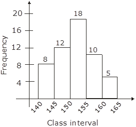
We have drowned the histogram by using the class-interval and frequency given in the question. The hight of the rectangle in the histogram shows the frequencies of class intervals.
AI is thinking…
Couldn't generate an explanation.
Generated by AI. May contain inaccuracies — always verify with your textbook.