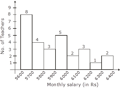
Draw a histogram to represent the following data :

By drawing monthly salary on ‘x’ axis and numbers of teacher on ‘y’ axis.
AI is thinking…
Couldn't generate an explanation.
Generated by AI. May contain inaccuracies — always verify with your textbook.
