Draw a histogram for the frequency distribution of the following data.
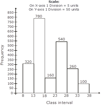
Class interval | 8-13 | 13-18 | 18-23 | 23-28 | 28-33 | 33-38 | 38-43 |
Frequency | 320 | 780 | 160 | 540 | 260 | 100 | 80 |
The given frequency distribution is in exclusive form, we will represent the class intervals along the X-axis and the corresponding frequency on the Y axis.
Now take the scale of,
1 big division = 5 units on X-axis,
1 big division = 50 units on Y axis
We will draw the rectangles with the class intervals as basis and the corresponding frequency as the height.
Thus, we get the following histogram.
AI is thinking…
Couldn't generate an explanation.
Generated by AI. May contain inaccuracies — always verify with your textbook.