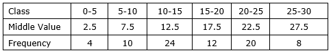
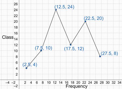
I draw the frequency polygon for the following frequency distribution table.

We will find the middle value of classes and then plot it on a graph with frequency as x coordinate and middle value as y coordinate to get the frequency polygon.
AI is thinking…
Couldn't generate an explanation.
Generated by AI. May contain inaccuracies — always verify with your textbook.


